Overhauling Depop’s onboarding
Depop’s biggest growth challenge was that over 90% of new users took no meaningful action on their first day.
I led the redesign of Depop’s end-to-end onboarding experience, transforming it from a lengthy setup flow into a personalised discovery experience that encouraged users to engage immediately.
The result:
26%+ increase in day-0 likes
28%+ increase in product views within 14 days
54%+ increase in onboarding completion
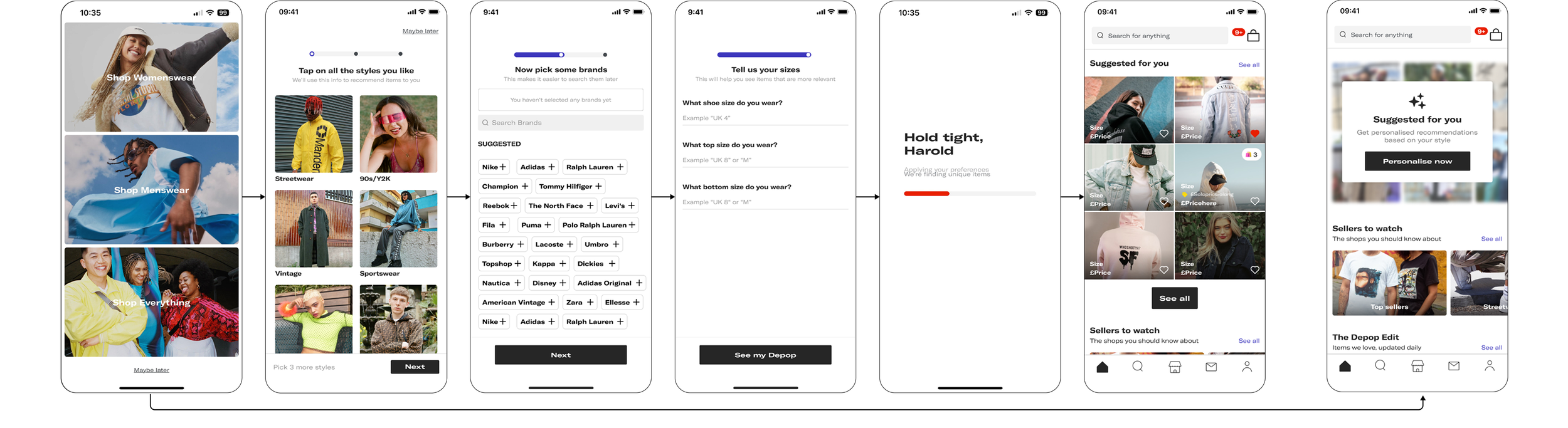
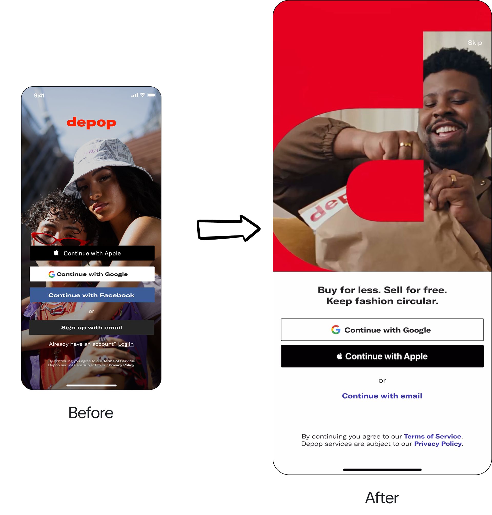
Before
After
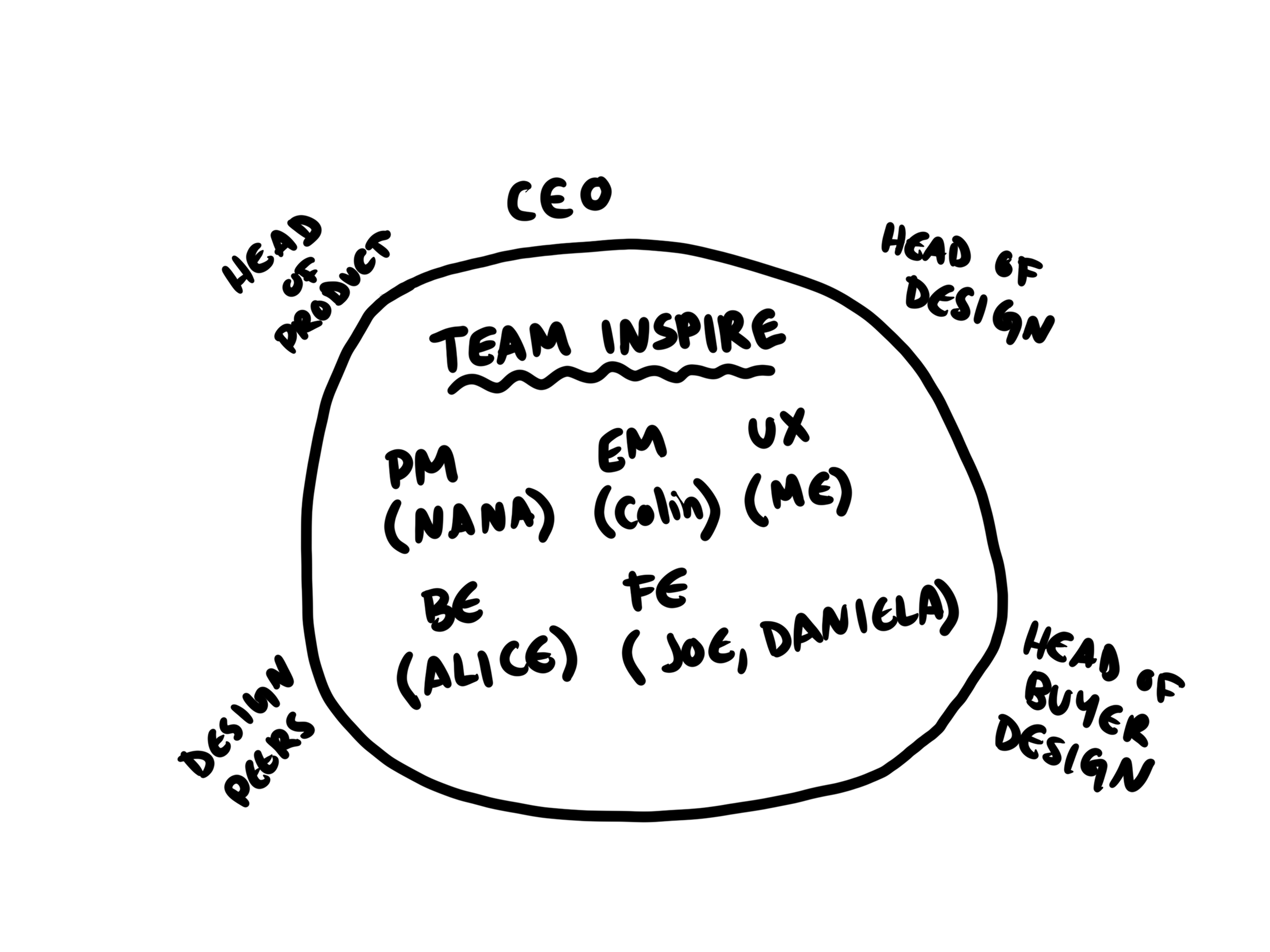
My role
Senior Product Designer, 6 month project
Team:
Staff Product Manager, Engineering Manager, 4 Engineers, Research (consulted), Brand & Creative
Responsibilities:
Defined onboarding strategy, Led UX and UI design, facilitated ideation workshops, conducted testing, research and synthesis, presented recommendations to leadership
Why this mattered
Onboarding sat at the centre of Depop’s growth strategy. Unfortunately, the existing experience wasn’t doing its job. This wasn’t simply a UX problem. It was a retention, activation and revenue problem.
90%+ of users took no meaningful day-0 action
68%+ never took meaningful action or converted
The experience was 2x slower than competitors
Nearly 30% of users skipped onboarding entirely
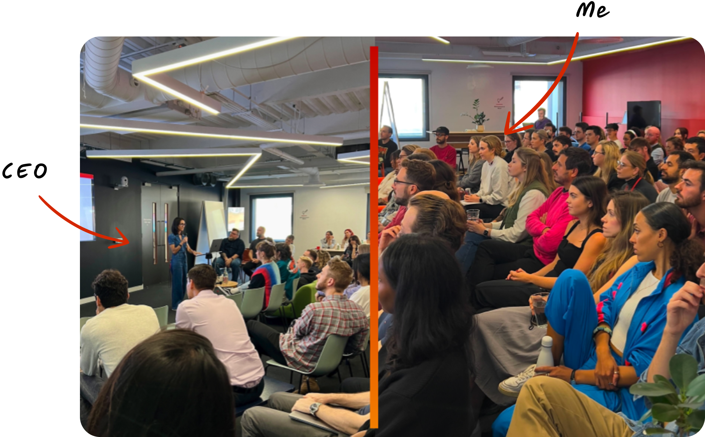
During my first week at Depop, CEO highlighted this problem in AllHands. Onboarding, truly, was an issue senior leadership team were paying close attention to because it represented one of the biggest opportunities to improve our growth.
The Challenge
The challenge wasn’t simply redesigning a flow. Multiple teams had competing opinions about what onboarding should achieve, whether it was product’s desire for richer personalisation signals or engineering navigating legacy systems.
The challenge was creating alignment around a single vision while delivering improvements incrementally. To keep momentum, I established a phased roadmap and a shared set of principles that guided decision making across the team.
What we learned
Before designing solutions, I wanted to understand why users weren’t engaging.
Through desk research, UX testing and competitor analysis, three themes consistently emerged.
1. The experience felt overwhelming
Users were asked to provide a large amount of information before receiving any value.
2. The experience felt low reward
Users completed onboarding but didn’t feel they received anything meaningful in return.
3. The experience felt easy to skip
There was little motivation to engage with personalisation because the value wasn’t obvious.
The problem wasn’t that users disliked personalisation. The problem was that we were asking for effort before providing value.
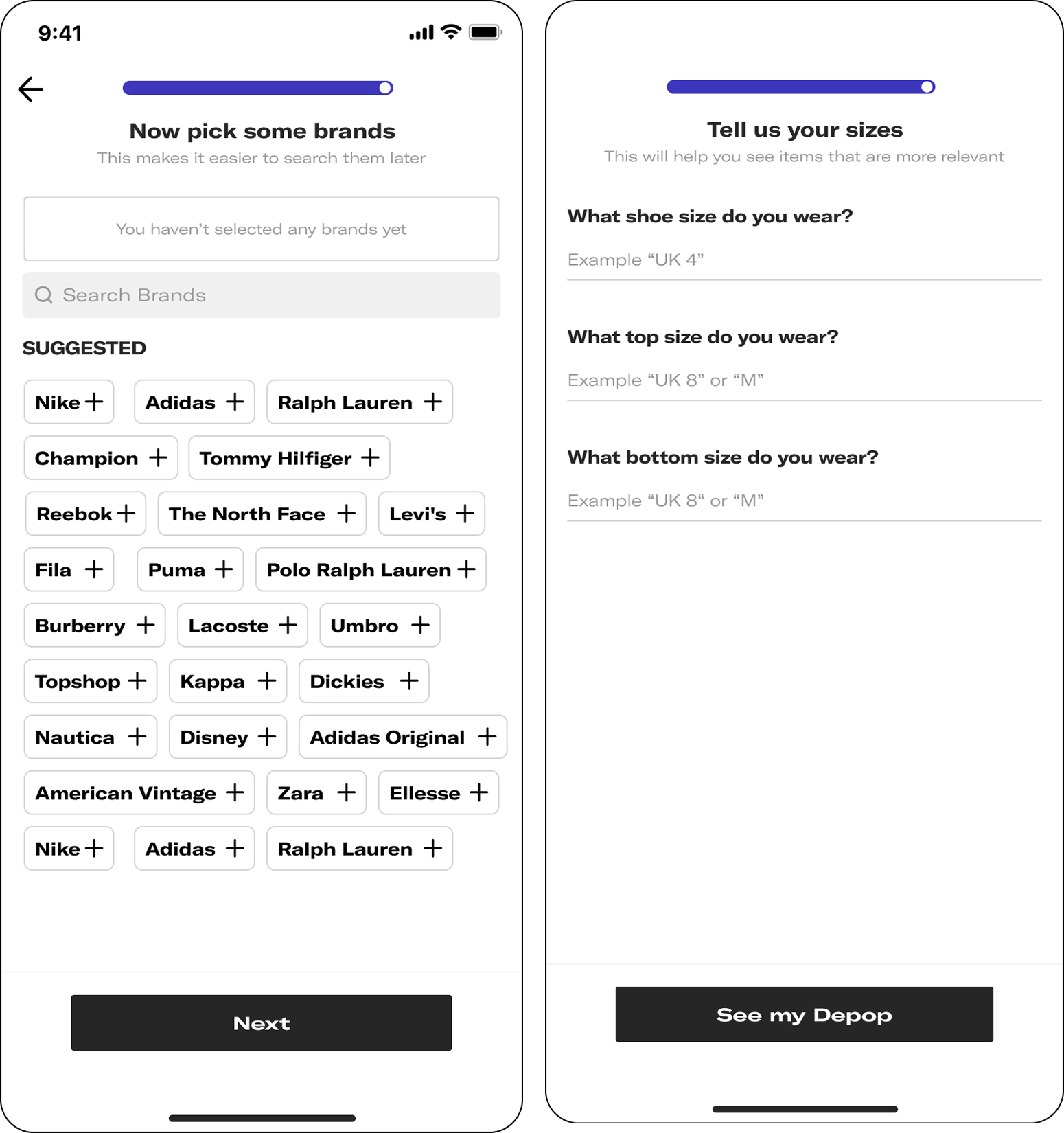
Old, unguided experience
Creating alignment
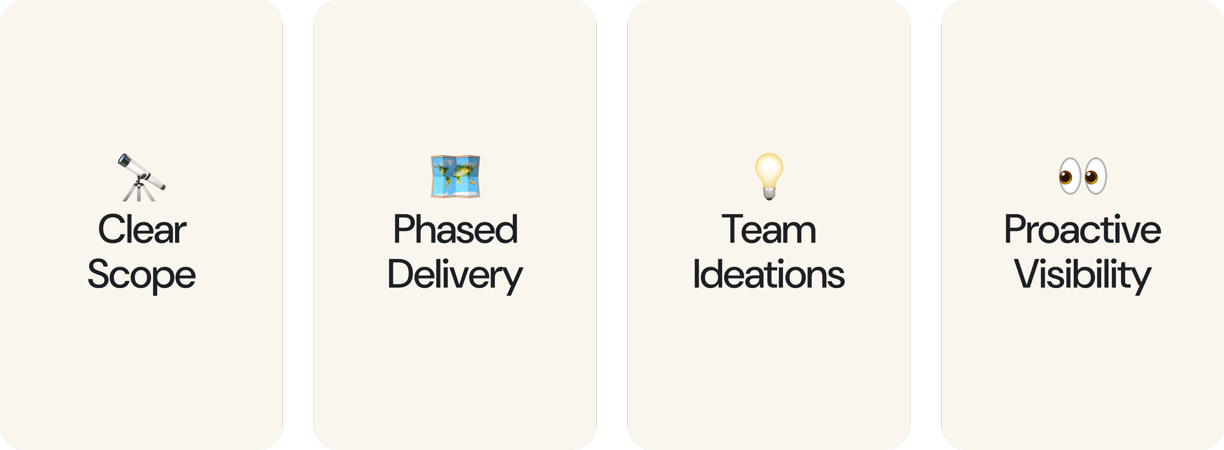
During early workshops, conversations repeatedly became stuck in individual feature debates. To create alignment, I introduced three principles that became the framework for roadmap prioritisation and design reviews.
Thrift 💨: what aspects of the flow are necessary?
Only ask for minimum amount of information necessary to improve recommendations. Experience should be as low-effort and efficient as possible.
Guidance 🧭: what aspects could be clarified?
Explain what we’re asking for and how it benefits users, to ensure they provide the best possible inputs.
Delight 💫: what could make the experience memorable so users return?
Create an experience that doesn’t feel like a chore, and instead feels like fun.
These principles became the foundation of the roadmap and helped us prioritise which opportunities to tackle first.
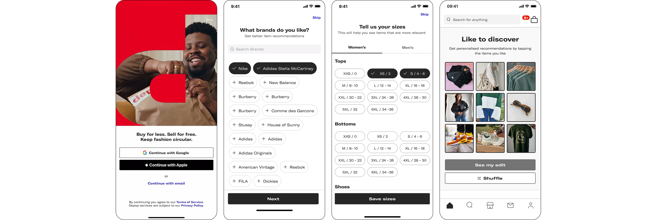
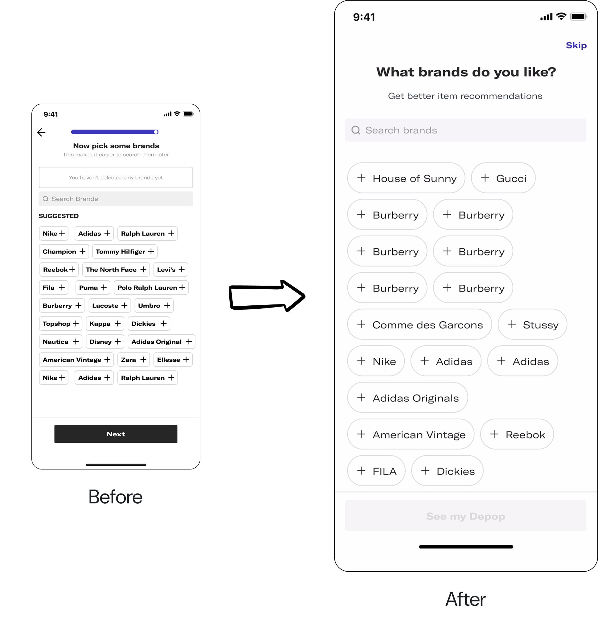
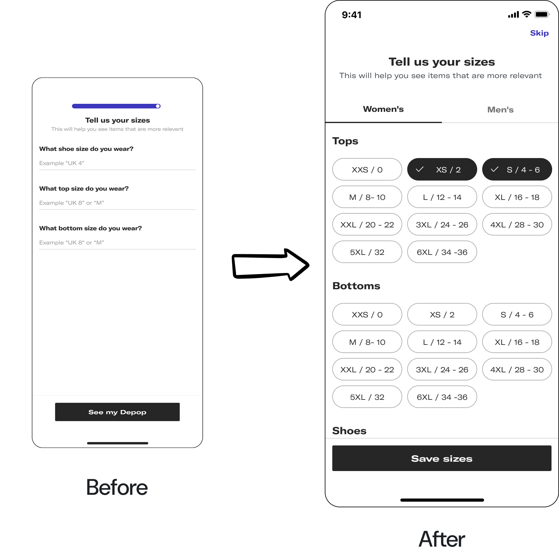
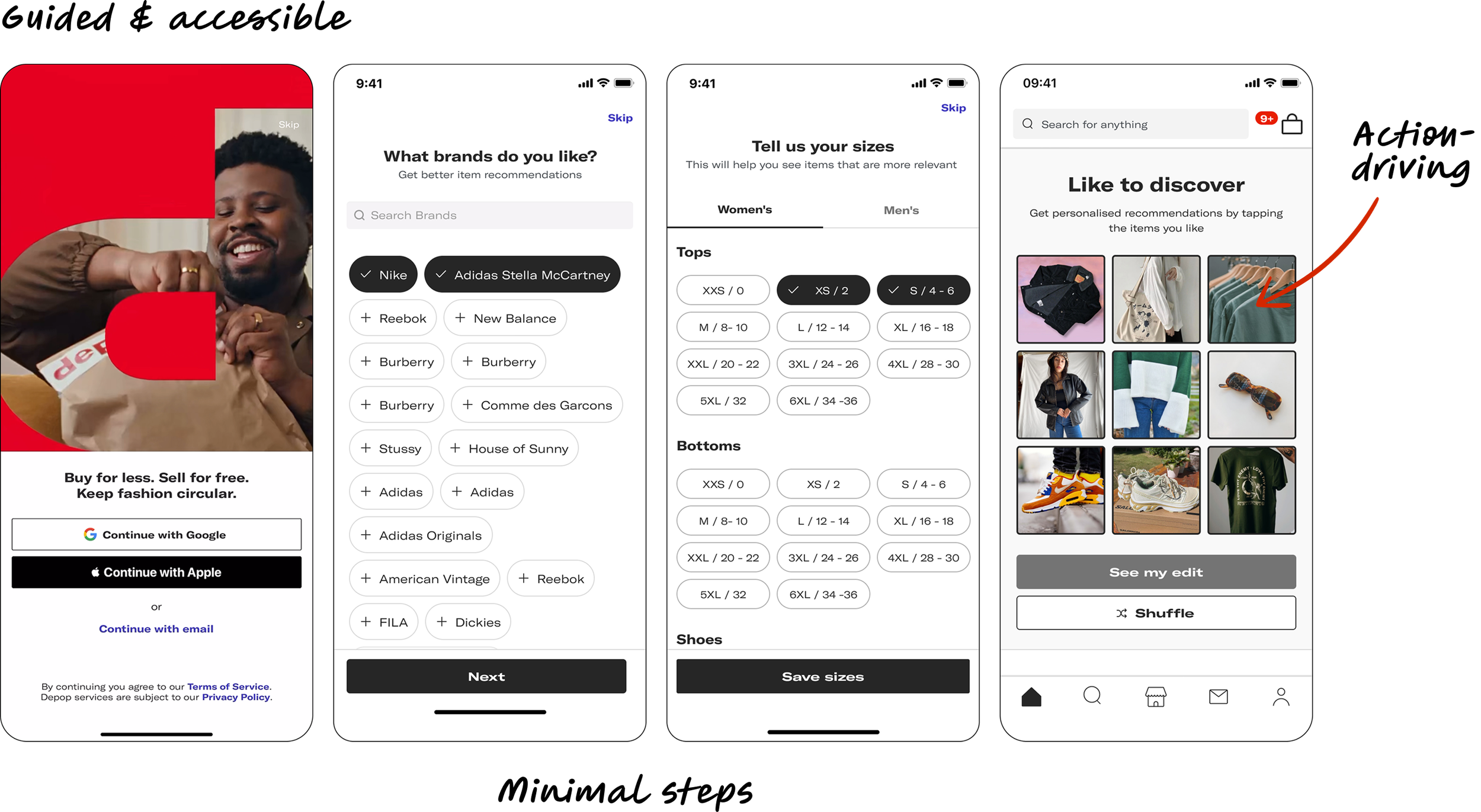
Key decision #1: Simplifying the journey
Our first priority was reducing friction. I analysed every onboarding step and challenged whether it was necessary. Several screens were removed entirely, and others were simplified or combined.
This significantly reduced time-to-value and improved completion rates. The goal wasn’t collecting more information. Instead, it was to help users reach relevant content faster.
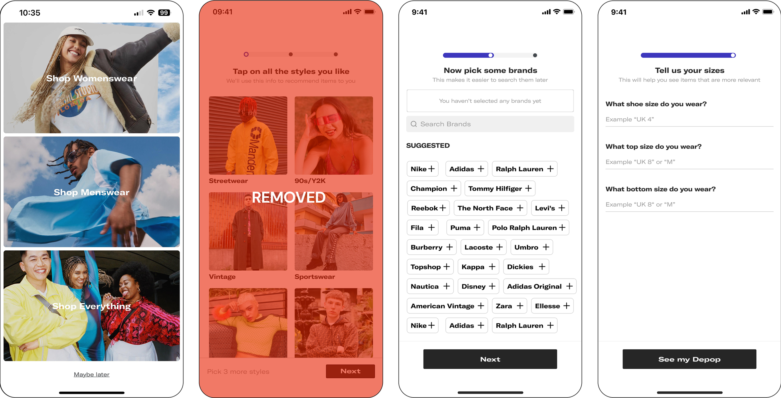
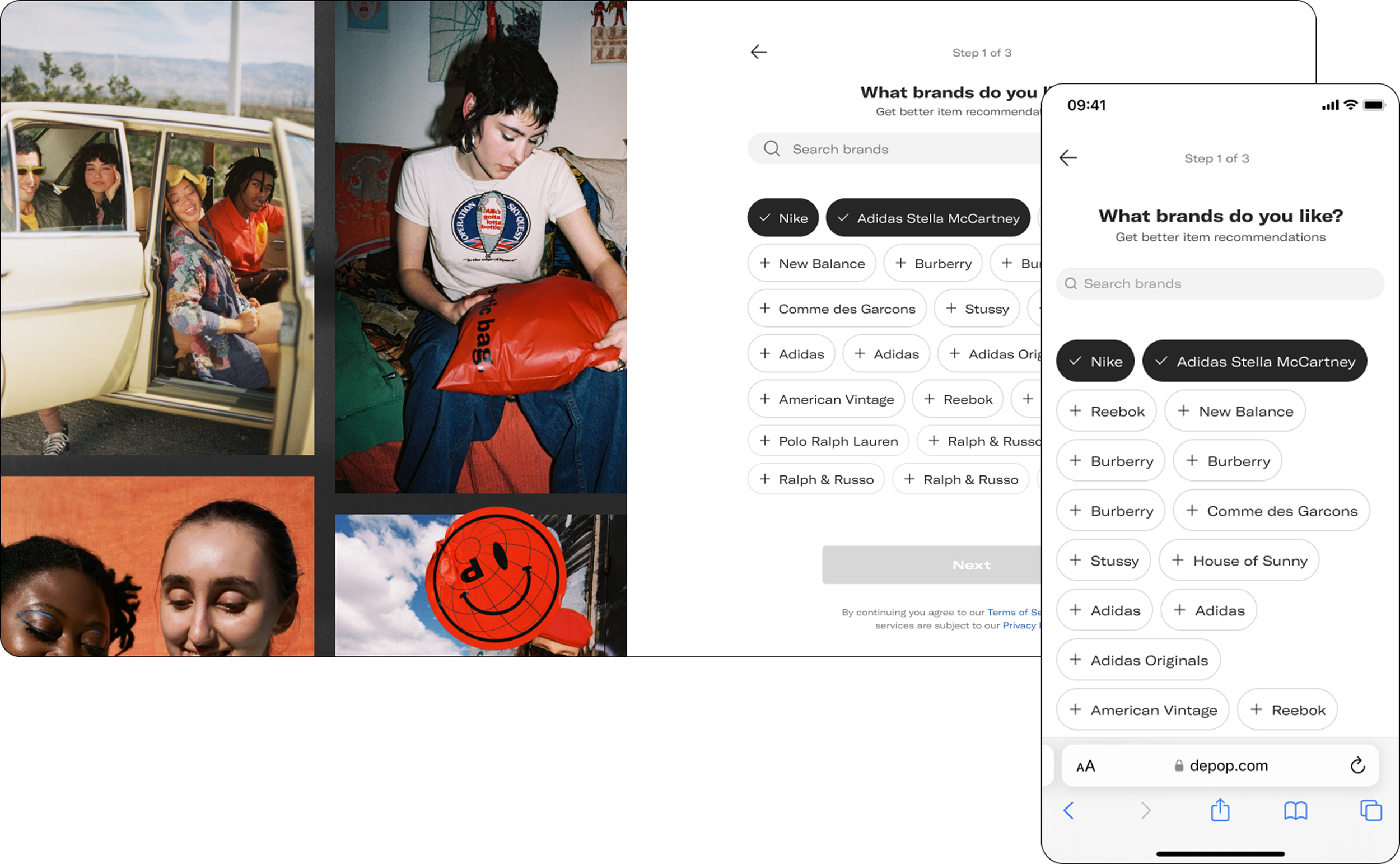
Key Decision #2: Improve guidance
Many users didn’t understand why Depop was asking for information such as favourite brands or clothing sizes. We introduced clearer explanations and contextual guidance throughout the flow.
Rather than feeling like a questionnaire, onboarding began to feel like a recommendation engine working on the user’s behalf. This increased adoption of both brand and size personalisation.


Key Decision #3: Create reason to act
This became the most important part of the project. Research showed that users weren’t engaging because onboarding felt like work. To really move the needle, I devised three concepts based on an ideation session with cross-functional stakeholders.
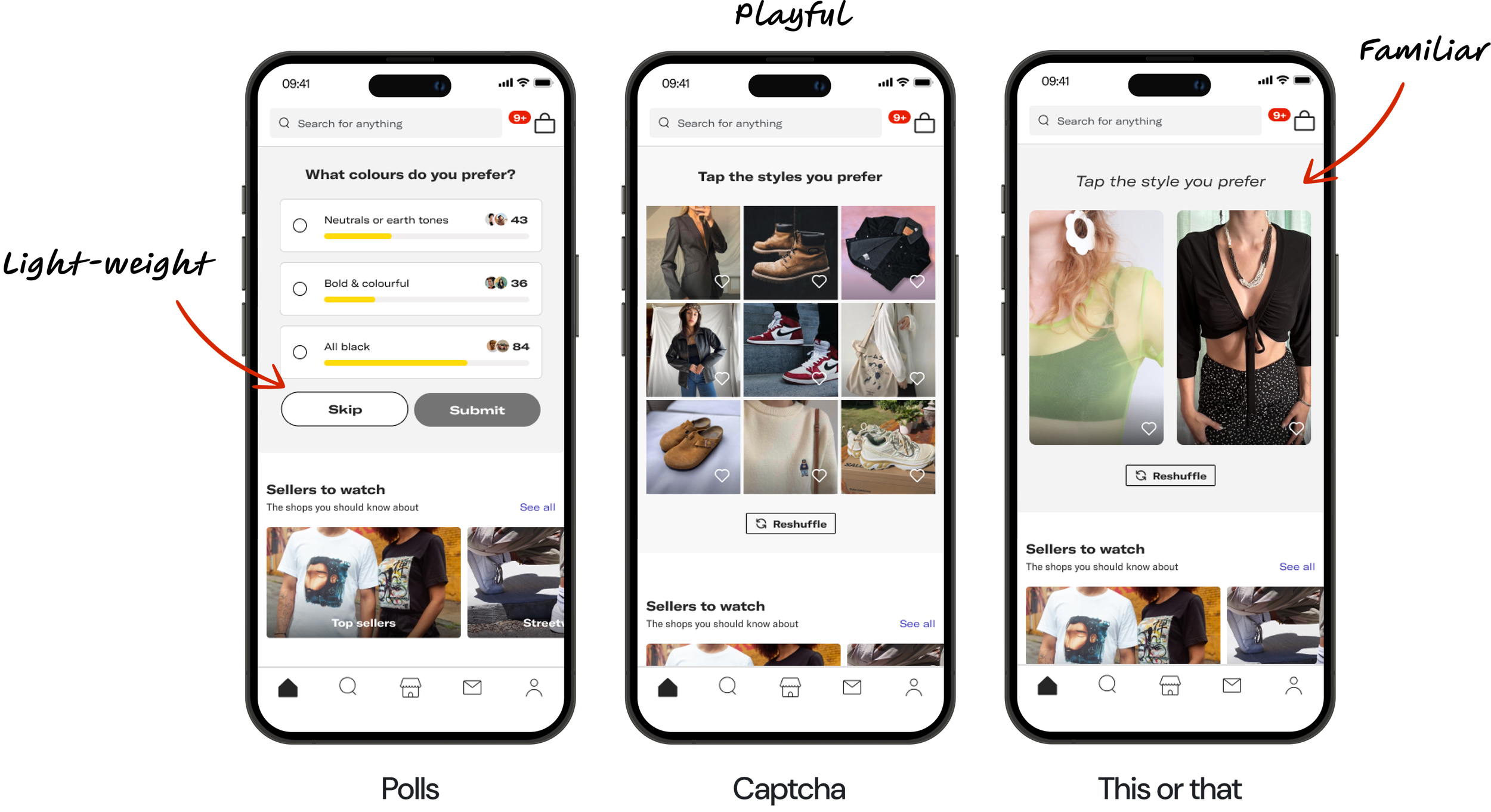
Polls
Low friction, but too shallow.
This Or That
Familiar interaction pattern, but still felt heavy.
Style Captcha
A grid-based interaction where users tapped styles they liked.
The concepts weren’t simply visual explorations. They were experiments designed to answer a specific question:
How might we encourage users to take action immediately instead of passively completing onboarding?
Style Captcha emerged as the strongest concept. Users described it as fun, rewarding and addictive. Most importantly, it encouraged meaningful interaction from the first session.
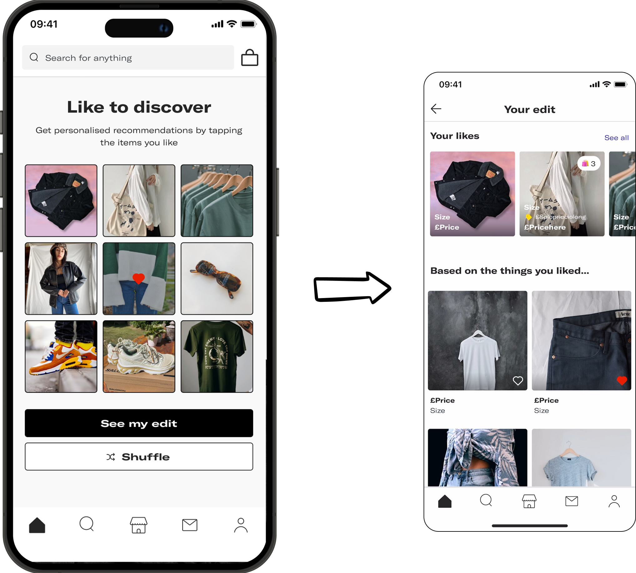
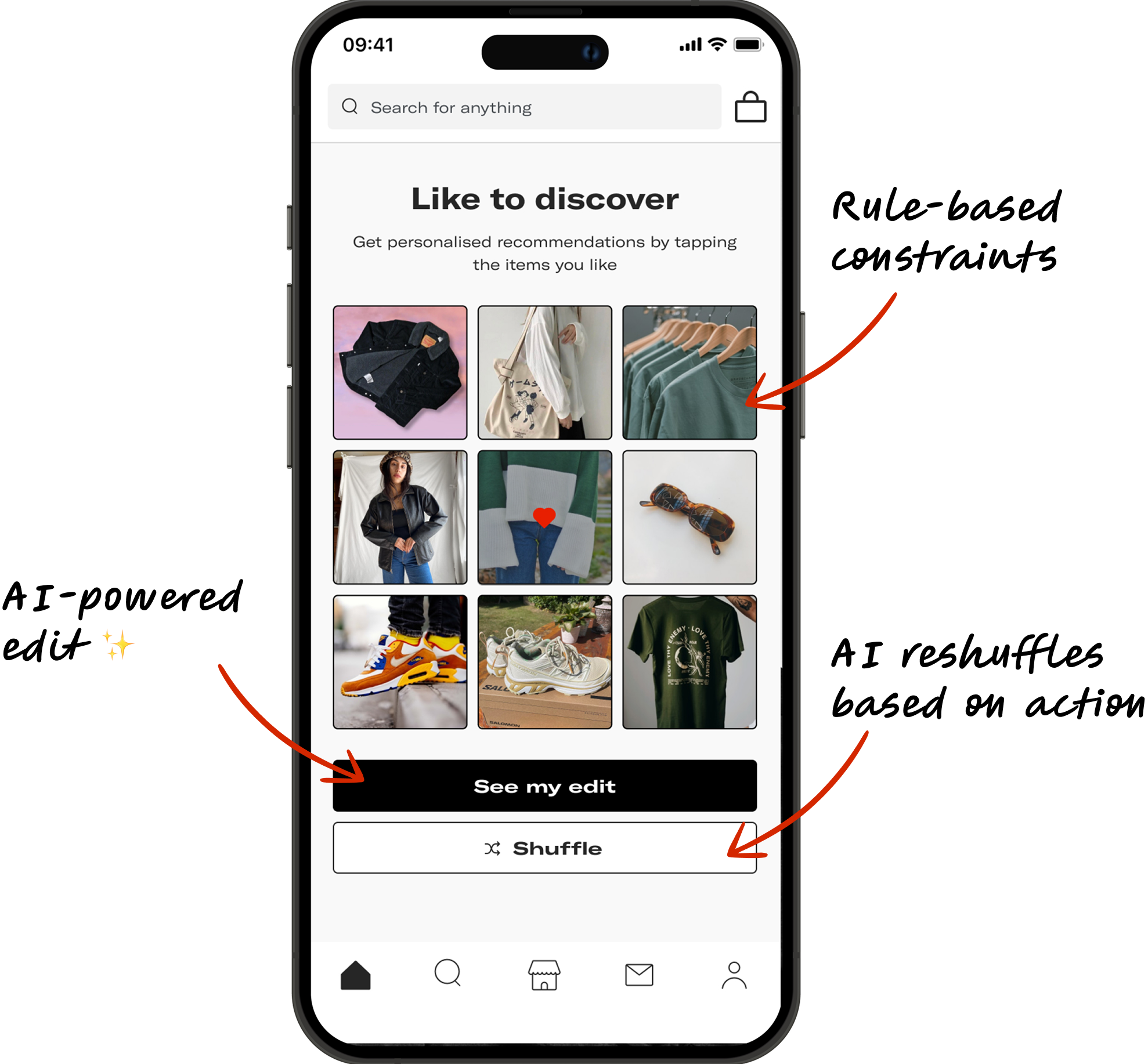
Scaling the experience with AI
Creating an enjoyable interaction wasn’t enough. The solution also needed to generate useful recommendation signals at scale.
To achieve this, I combined simple constraints with adaptive AI.
Limited items per category to avoid overwhelming users
AI reshuffled recommendations based on interactions
Personalised recommendations unlocked after only a few interactions
This balanced user value and business value. Users received immediate personalisation, and Depop received richer behavioural signals earlier in the journey.
As a result, the recommendation experience became both playful and useful.
Outcomes
The real measure of success wasn’t any individual screen. Rather, it was whether we solved the underlying activation problem.
Before
90%+ of users took no day-0 action
68%+ never took meaningful action
Onboarding was 2x slower than competitors
After
26%+ increase in day-0 likes
28%+ increase in product views within 14 days
54%+ increase in onboarding completion
Together, these changes transformed onboarding from a setup flow into a discovery experience.
Scaling beyond mobile
With strong results on mobile, I expanded the work across platforms. I helped align onboarding with Depop’s design system to improve consistency and scalability across web and mobile.
At the same time, Style Captcha evolved beyond onboarding and became a standalone personalisation initiative being explored elsewhere in the product.
As a result, the impact extended far beyond the original project.
Reflections
Collaborate Early
Early alignment with engineers surfaced legacy technical constraints and helped the team prioritise more effectively.
Scale Insights, Not Just Features
The most valuable outcome wasn’t a screen.
It was the personalisation framework and learnings that influenced future initiatives.
Validate Quickly
Rapid testing allowed us to build confidence in recommendation quality before scaling the experience further.
Key Takeaway
The biggest lesson from this project was simple:
Users are far more willing to provide information when they receive value immediately in return. The most successful onboarding experiences don’t collect data, they create momentum.