
Personalising the Depop landing experience
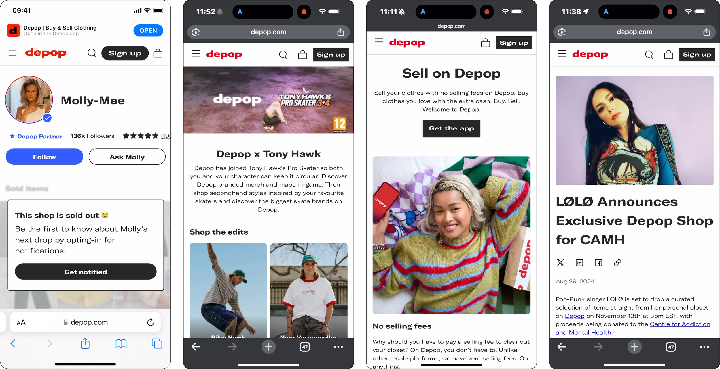
Millions of users were discovering Depop through Google, social media, partnerships, and organic search, but high-intent traffic wasn’t converting. Users often landed in experiences that didn’t match their expectations, resulting in bounce rates of 60–70% and conversion rates of only ~2%. I led a six-month initiative to redesign Depop’s landing experiences and turn more intent into action.
The result:
–7% shop bounce
+24% homepage engagement
+25% landing page CTA clicks
3x faster campaign launches
Cross-experience overhaul
My role
Senior Product Designer, 6 month project
Team:
Senior Product Manager, Engineering Manager, 2 Engineers, marketing & brand
Responsibilities:
I led the end-to-end design strategy across acquisition surfaces.
Defining the problem space
Running user research
Facilitating cross-functional workshops
Creating a shared acquisition framework
Designing landing experiences
Building scalable campaign systems
Partnering closely with product, engineering, marketing and brand
Because campaigns moved quickly, I also incorporated AI into my workflow to accelerate insight synthesis, copy exploration and concept development while keeping decisions grounded in user needs.
Why this mattered
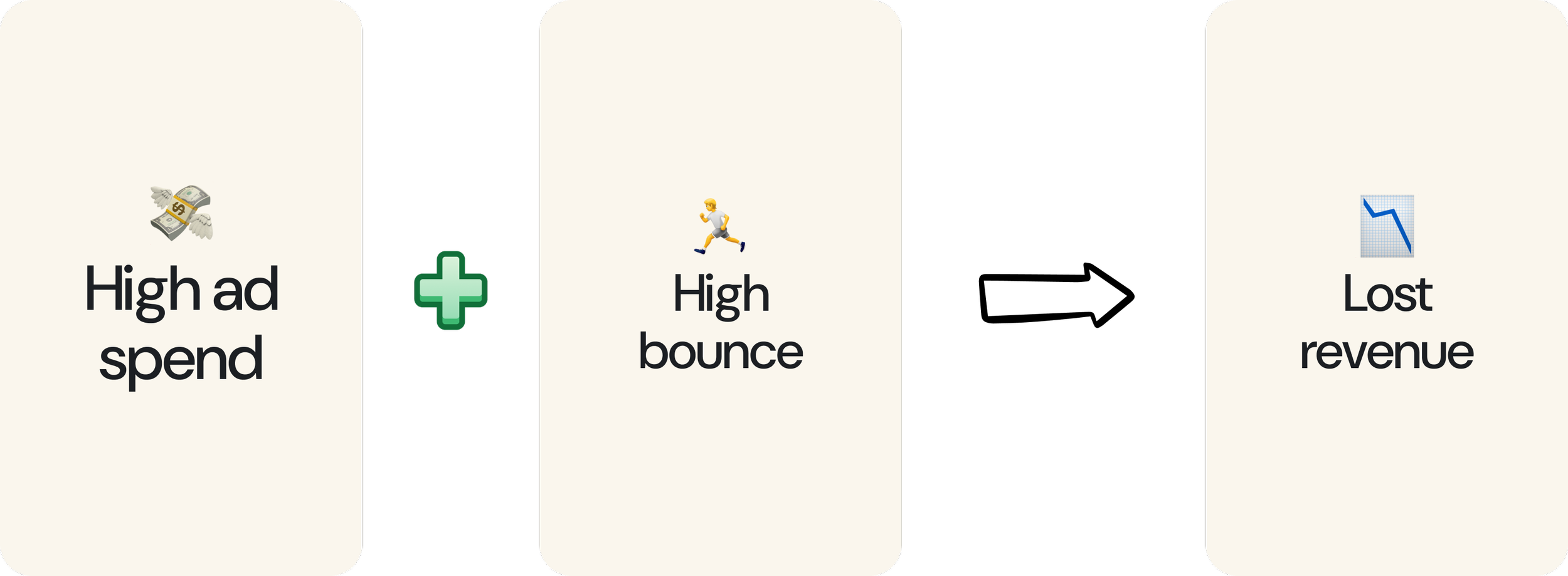
Every abandoned session represented more than a poor user experience.
It represented wasted marketing spend, missed revenue and growing pressure from stakeholders investing heavily in acquisition.
This became a strategic priority across product, marketing and leadership.
Improving conversion meant ensuring every entry point worked harder for both users and the business.
Driving alignment before designing
One of the biggest challenges wasn’t design, it was coordination.
Acquisition campaigns involved multiple teams working on tight timelines, with high-profile NDA partnerships and significant commercial investment.
Without alignment, decisions moved slowly and opportunities were missed.
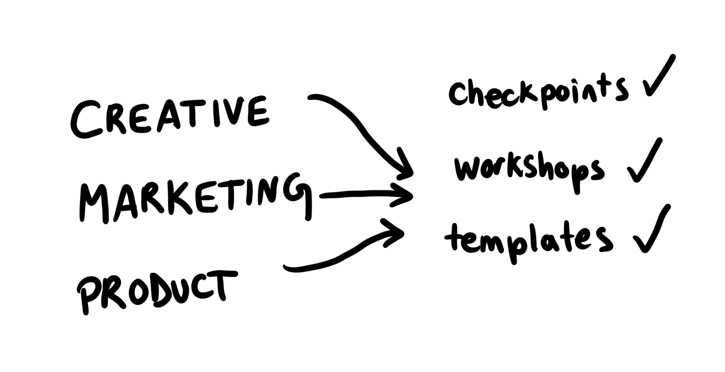
To create momentum, I introduced lightweight collaboration rituals:
Shared scoping templates
Helping marketing communicate campaign requirements earlier.
Cross-functional workshops
Aligning teams around user journeys rather than individual deliverables.
Async checkpoints
Reducing meeting overhead while maintaining visibility.
These practices helped create a shared understanding of both the opportunity and the constraints before design work began.
Understanding the intent gap
Before proposing solutions, I wanted to understand where users were losing momentum.
I conducted rapid usability testing across Depop’s largest acquisition channels.
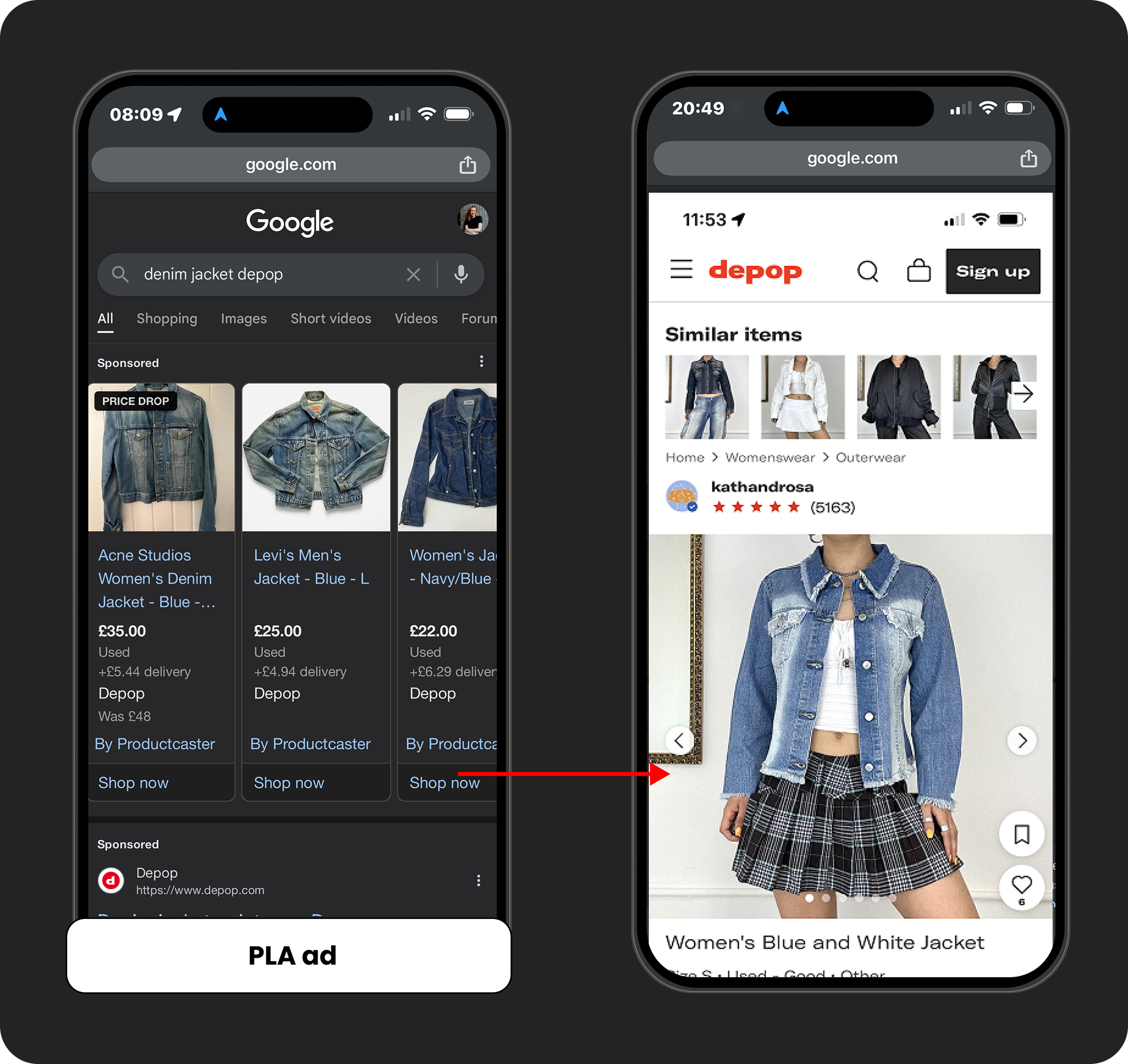
Google Shopping
Users frequently landed on sold-out products or cluttered experiences. instead of progressing toward purchase, many stalled immediately.
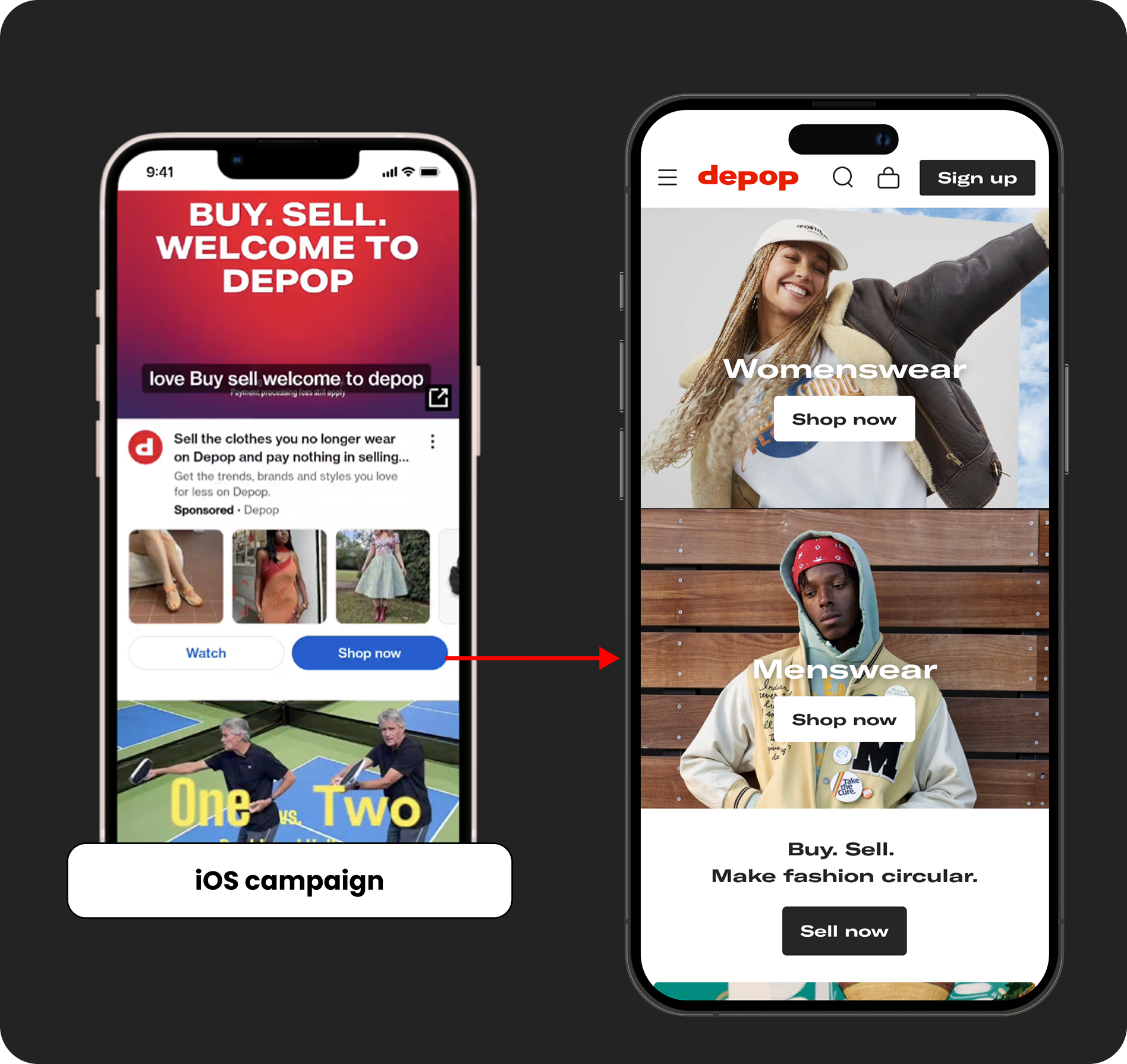
YouTube
The ads successfully generated excitement and curiosity. The landing experience didn’t.
Users were dropped onto generic homepages that felt disconnected from the story they had just watched.
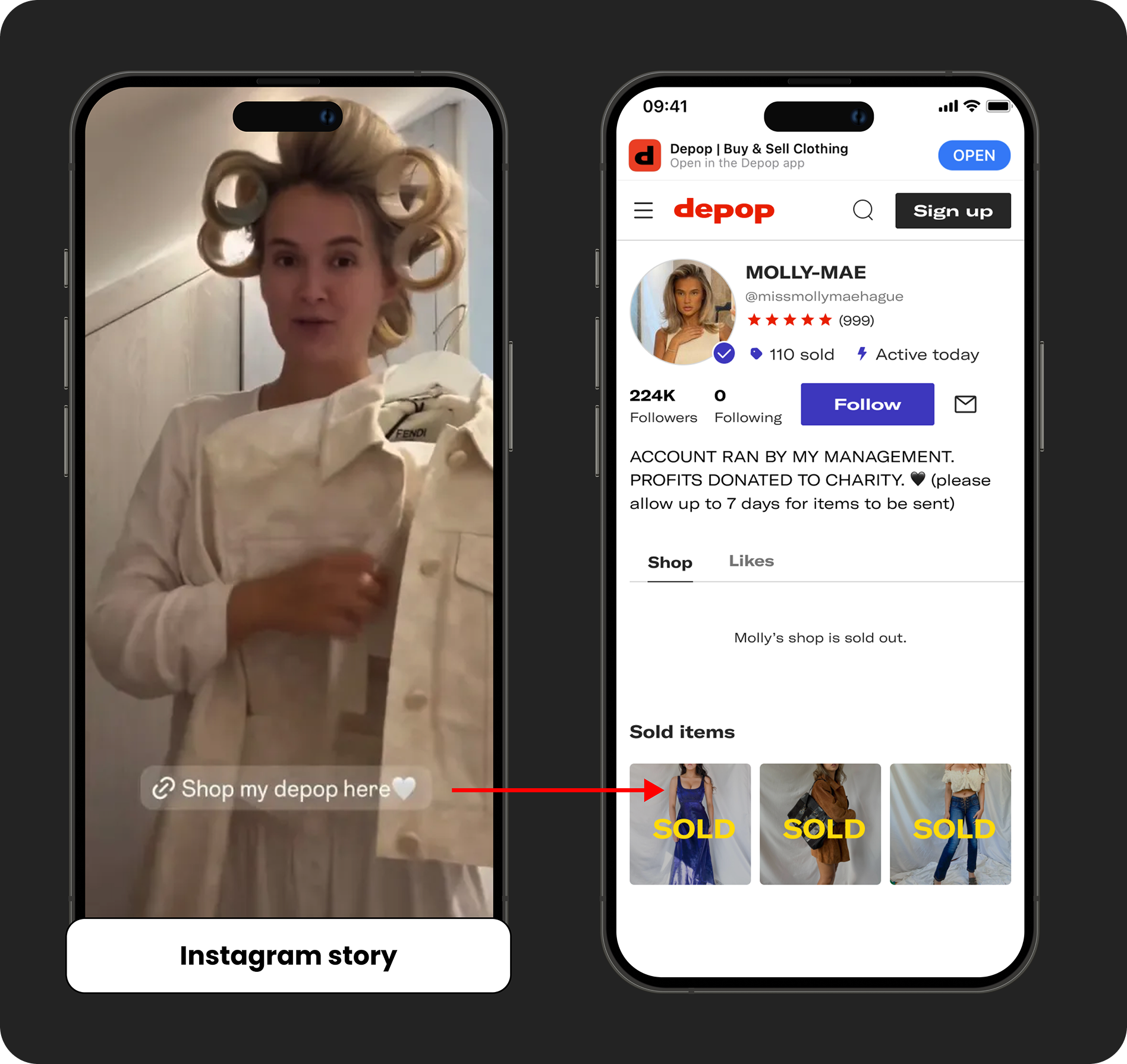
Influencer campaigns generated highly motivated traffic, but when items sold out, users hit a dead end with nowhere to continue exploring.
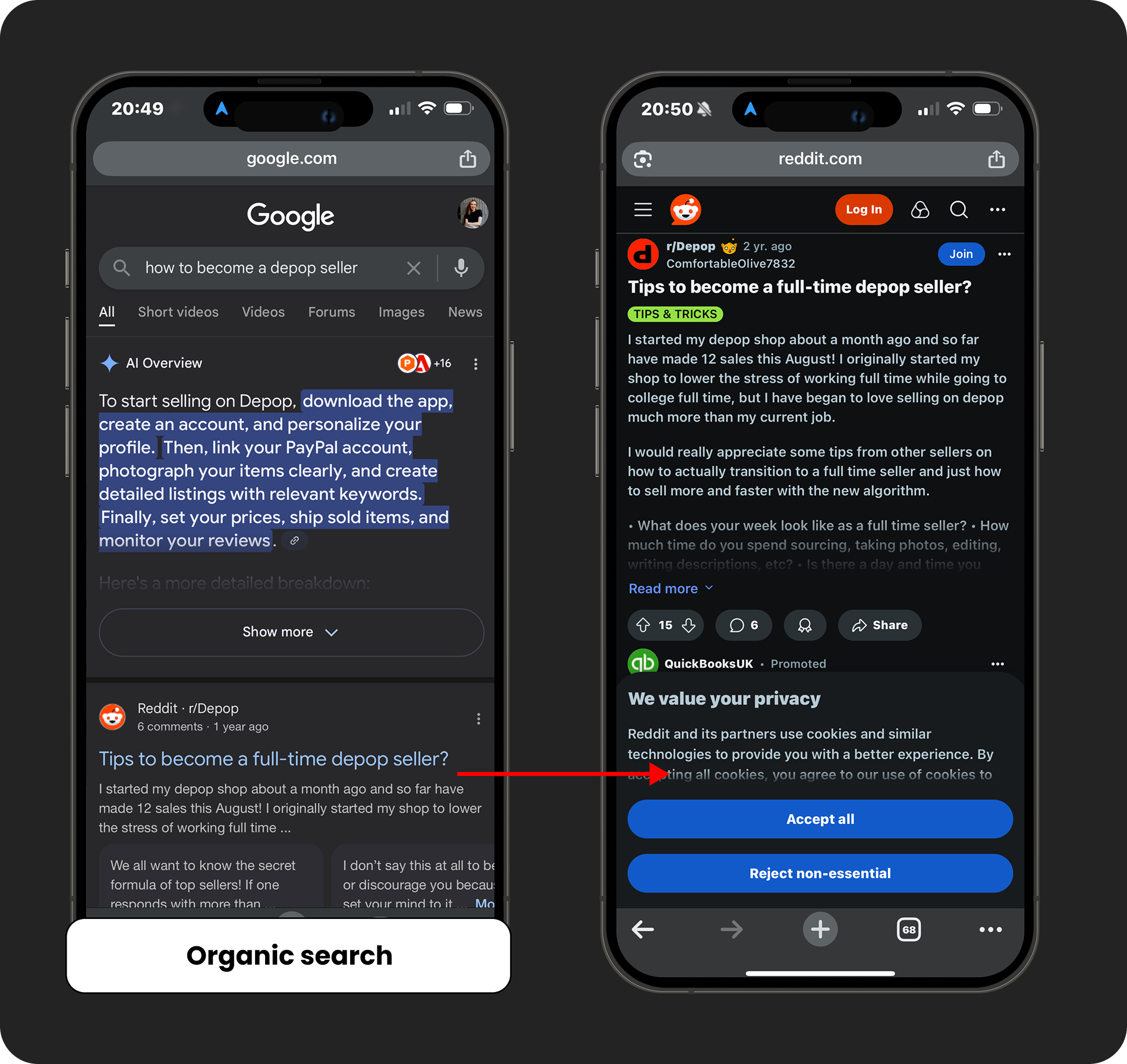
Organic search
Potential sellers often discovered Depop through third-party forums rather than official content.
Many encountered negative discussions before interacting with the platform itself.
Reframing the problem
Rather than treating each channel independently, I helped the team align around three strategic questions:
Intent
Are we matching why users came here?
Action
What behaviours actually matter to Depop?
Clarity
What experience should every acquisition surface ultimately deliver?
These questions became the foundation for the rest of the work.
Finding the patterns
I reviewed best-in-class acquisition experiences across ecommerce, marketplaces and creator platforms.
Three recurring themes emerged:
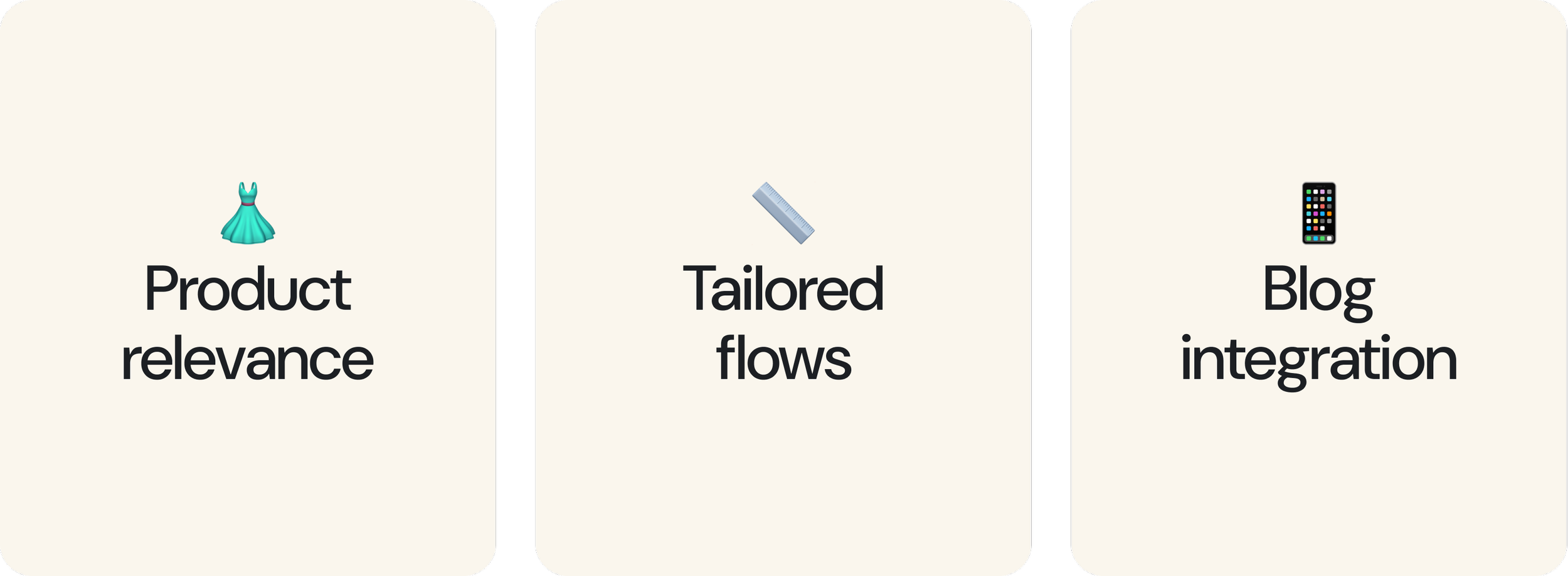
Relevant destinations
Users were guided toward content that matched their intent.
Tailored journeys
Experiences adapted to acquisition source rather than sending everyone to the same destination.
Content that built trust
Educational and editorial content supported decision-making instead of pushing users off-platform. These themes became the basis for our ideation work.
Turning insights into momentum
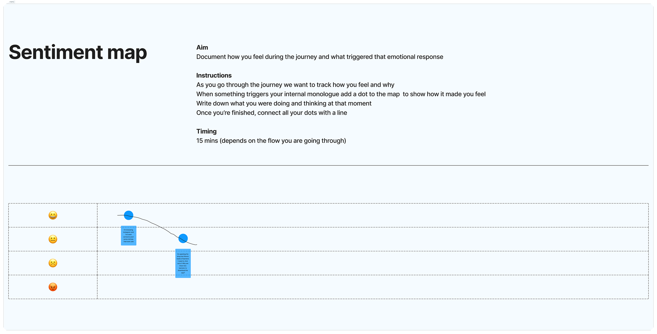
To translate research into action, I led cross-functional ideation workshops that brought product, engineering, marketing, and brand stakeholders together around a shared understanding of the user journey. By grounding discussions in user insights, friction points, and examples from best-in-class experiences, we collaboratively generated and prioritised opportunities that informed the roadmap, aligned the team around user needs, and built broader ownership of the problem.
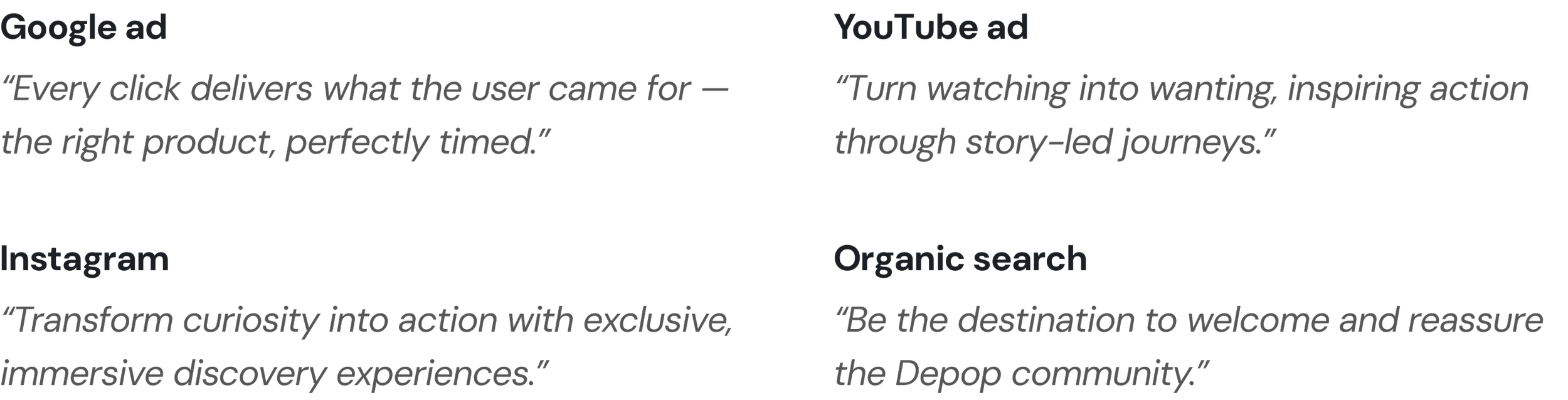
Creating a shared vision
To ensure consistency across channels, I synthesised research, stakeholder ideas and competitive insights into a set of acquisition principles. These principles helped teams make decisions independently while still moving toward the same north star.
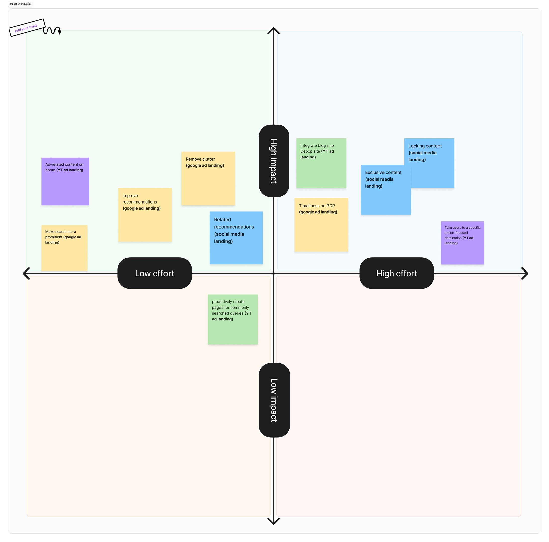
From Vision To Roadmap
With alignment established, I worked with product and engineering leadership to prioritise opportunities. Rather than focusing only on effort and impact, we evaluated ideas through the lens of our acquisition principles. This helped us identify investments that delivered immediate results while also strengthening the long-term system.
Roadmap
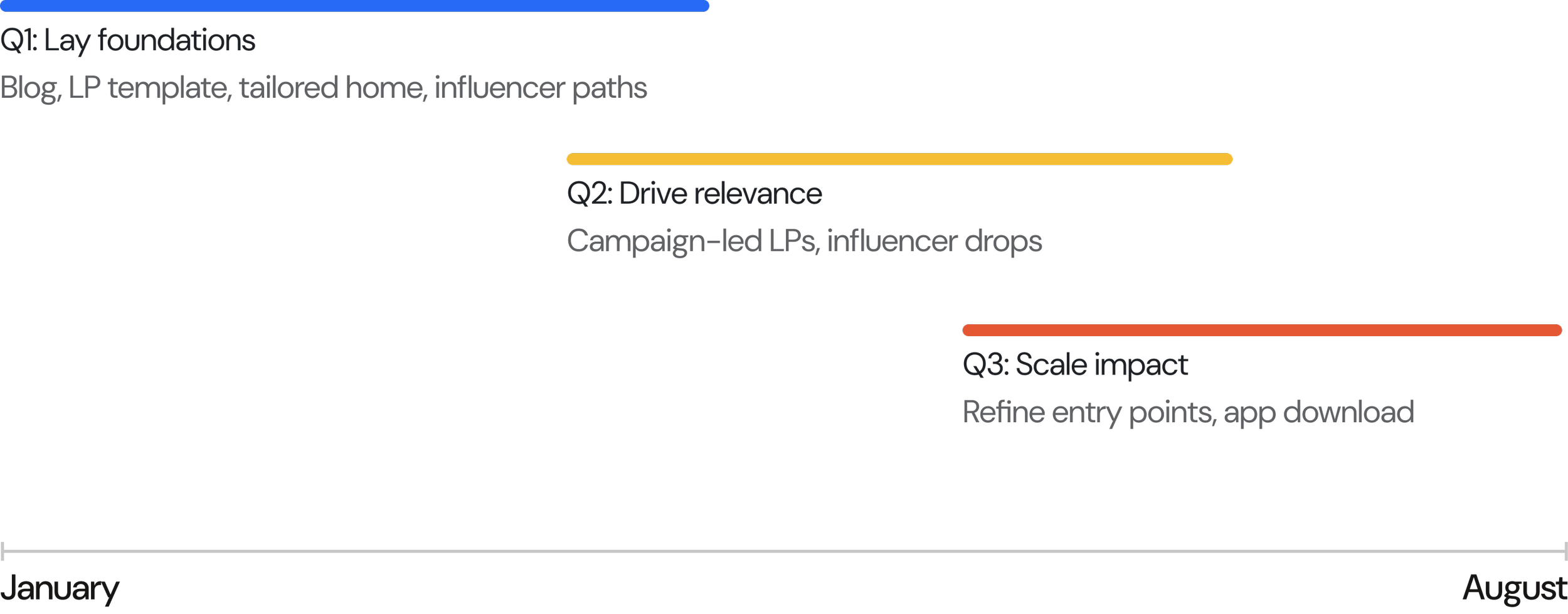
What we shipped
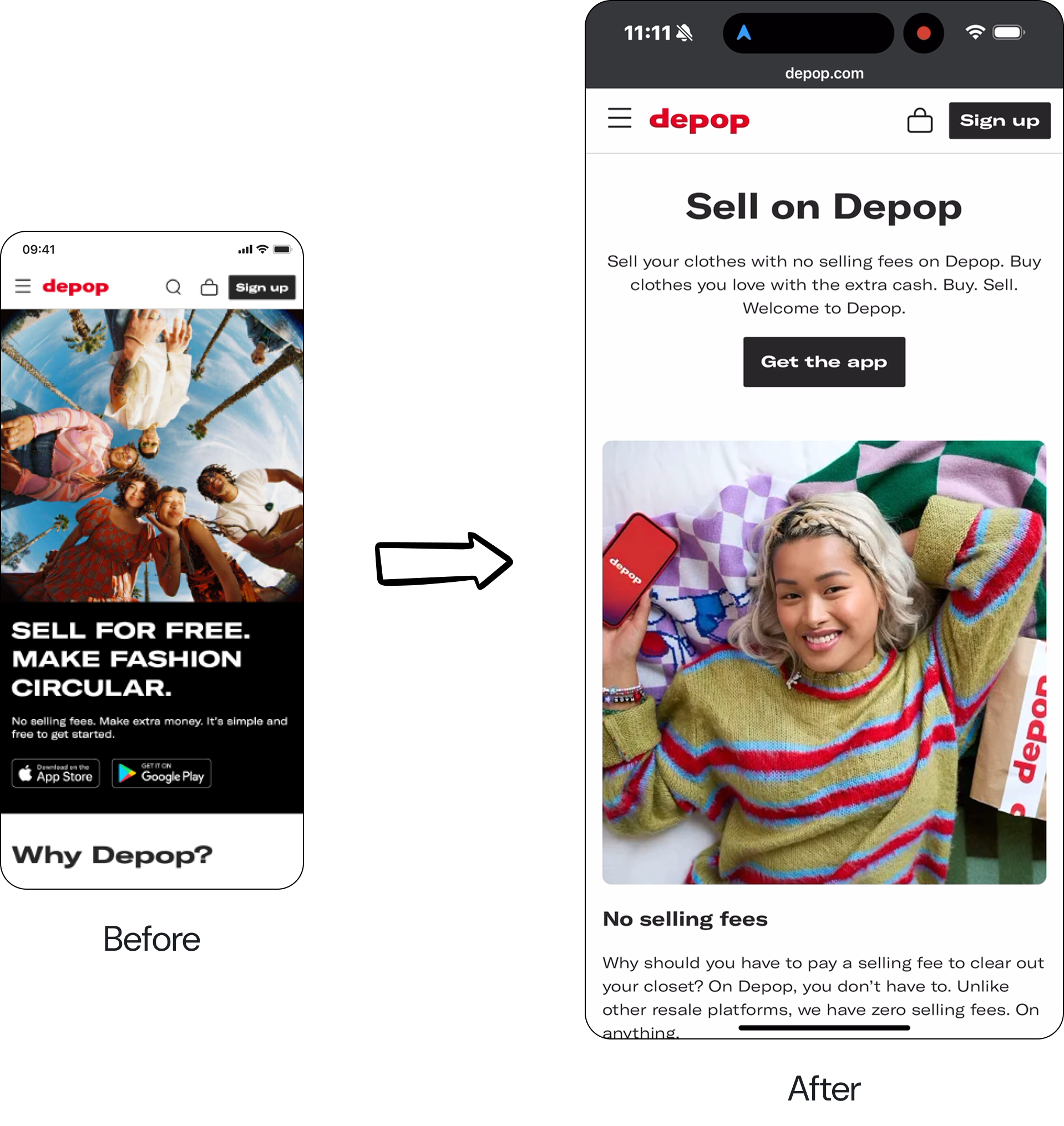
More Relevant Landing Pages
We redesigned campaign destinations around clearer hierarchy, stronger storytelling and focused calls-to-action.
Result:
Bounce rate reduced by 2%
CTA engagement increased by 24%
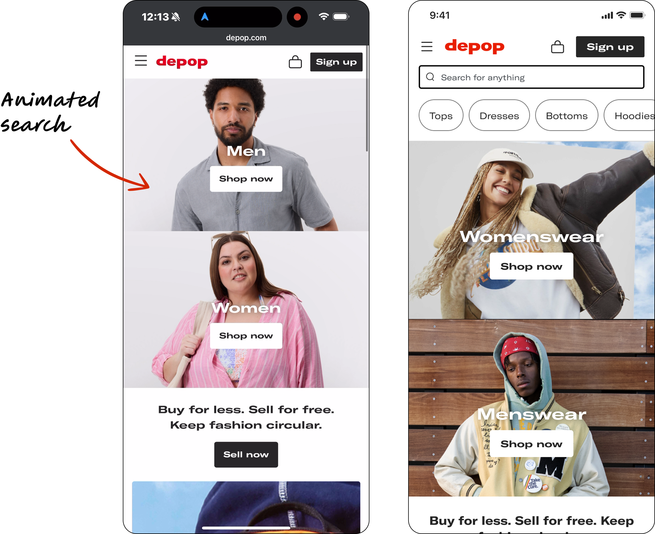
A More Focused Homepage
We restructured entry points to help new users immediately understand where to go next.
Result:
+24% homepage engagement
+2.53% search activity
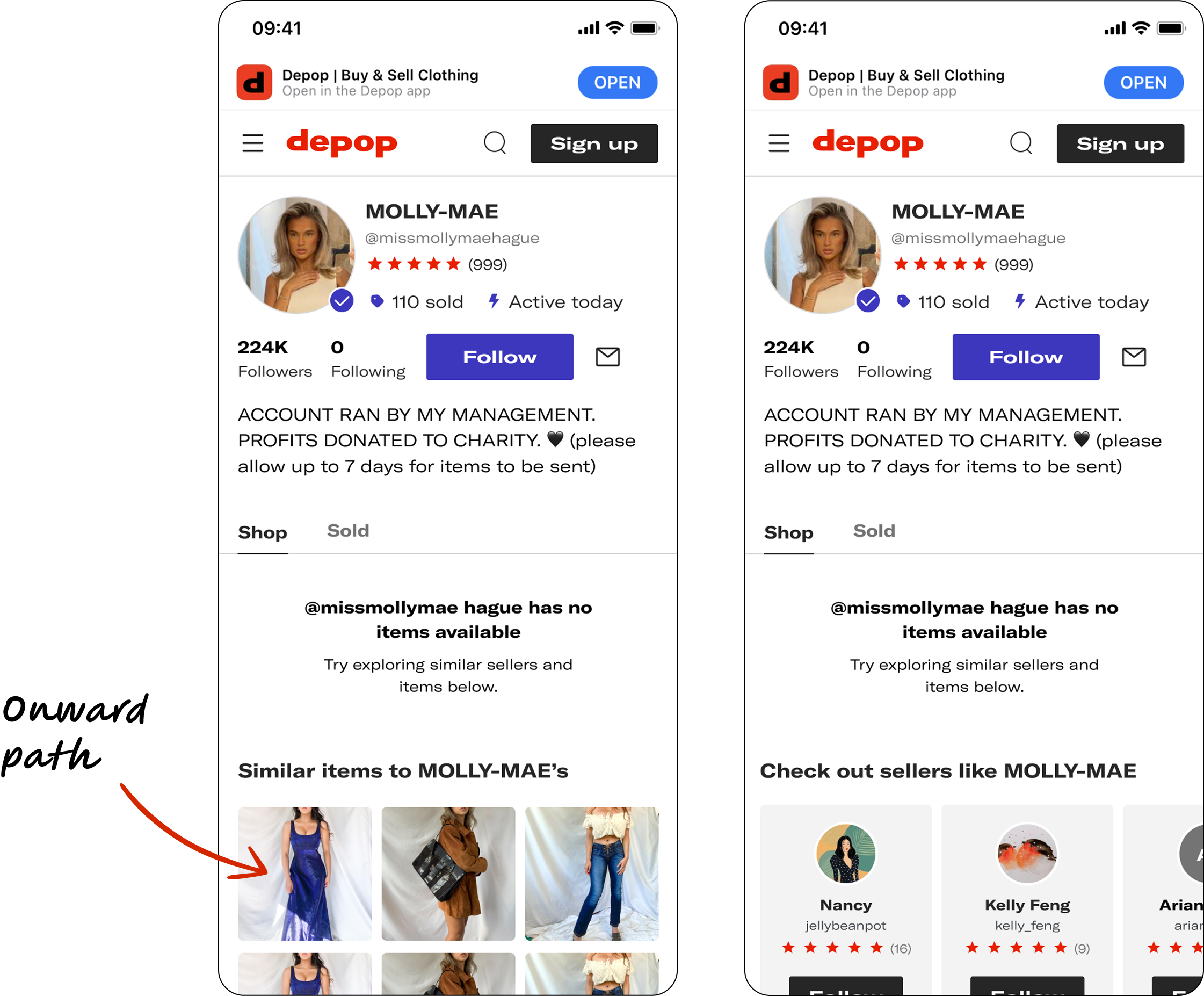
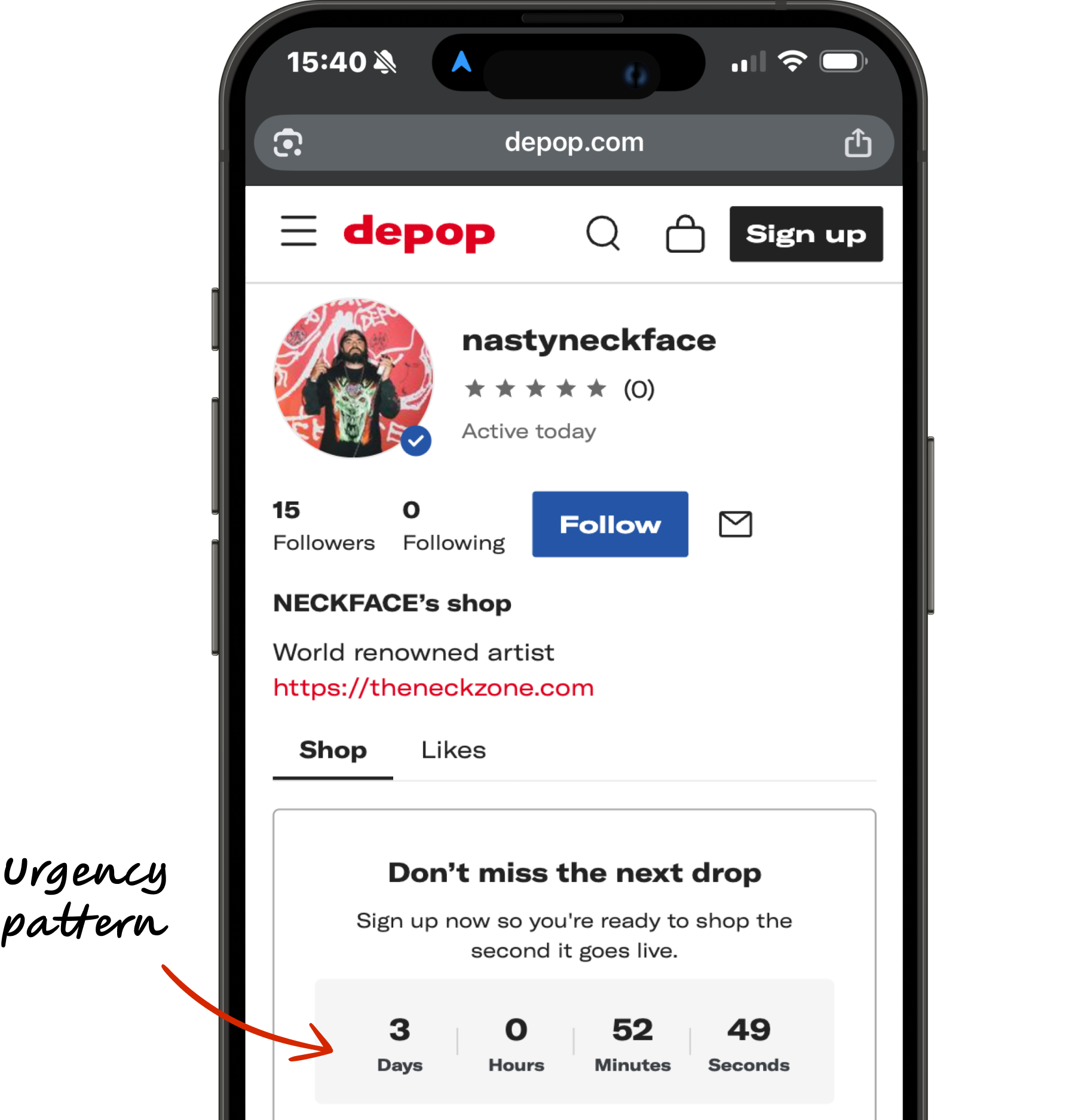
Influencer Discovery Beyond Sold-Out Products
Instead of ending journeys when products sold out, we introduced onward paths through similar products and sellers.
Result:
7% reduction in shop bounce
A Scalable Content System
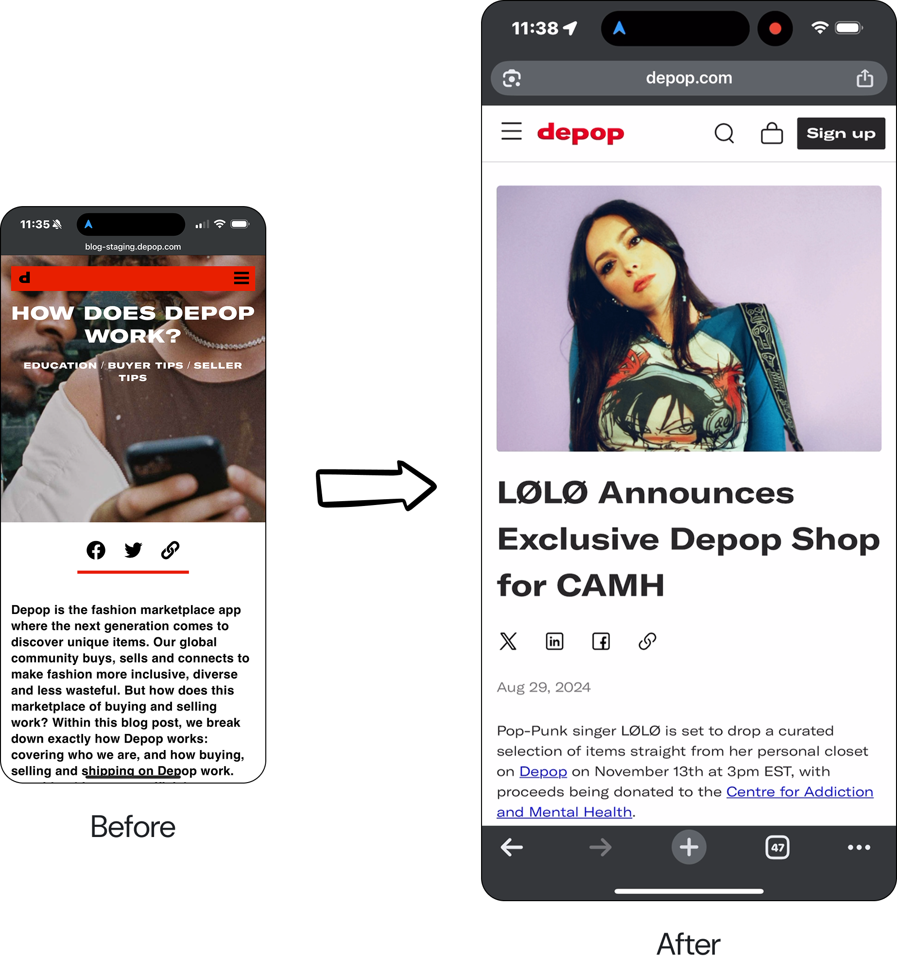
I created a reusable blog framework and self-serve components that improved consistency, SEO and publishing efficiency. Before, the blog missed the mark on accessibility and was not integrated into the Depop site. As a result, it failed both product discovery and SEO aims.
This new system allowed marketing teams to focus on creating more content and driving users to our platform, rather than rebuilding layouts.
Scaling Beyond Individual Campaigns
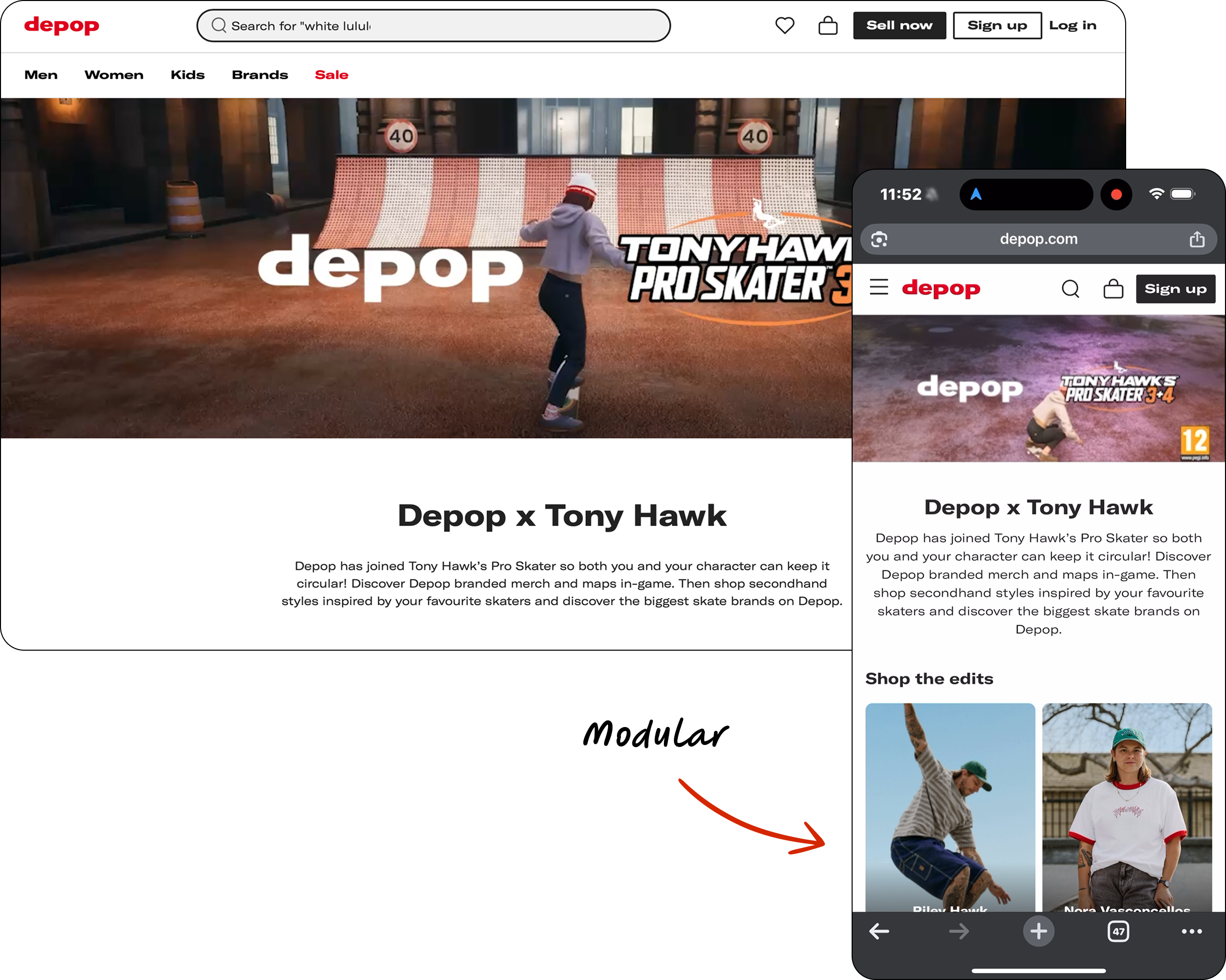
One of the most valuable outcomes wasn’t a landing page, it was a system. Idesigned reusable campaign frameworks that dramatically reduced launch effort.
The first major test came with the Tony Hawk partnership. Using the new framework, the team launched the campaign three times faster than previous approaches.
The same foundations later enabled influencer drops and future partnership experiences.
Impact
The work validated our original hypothesis.
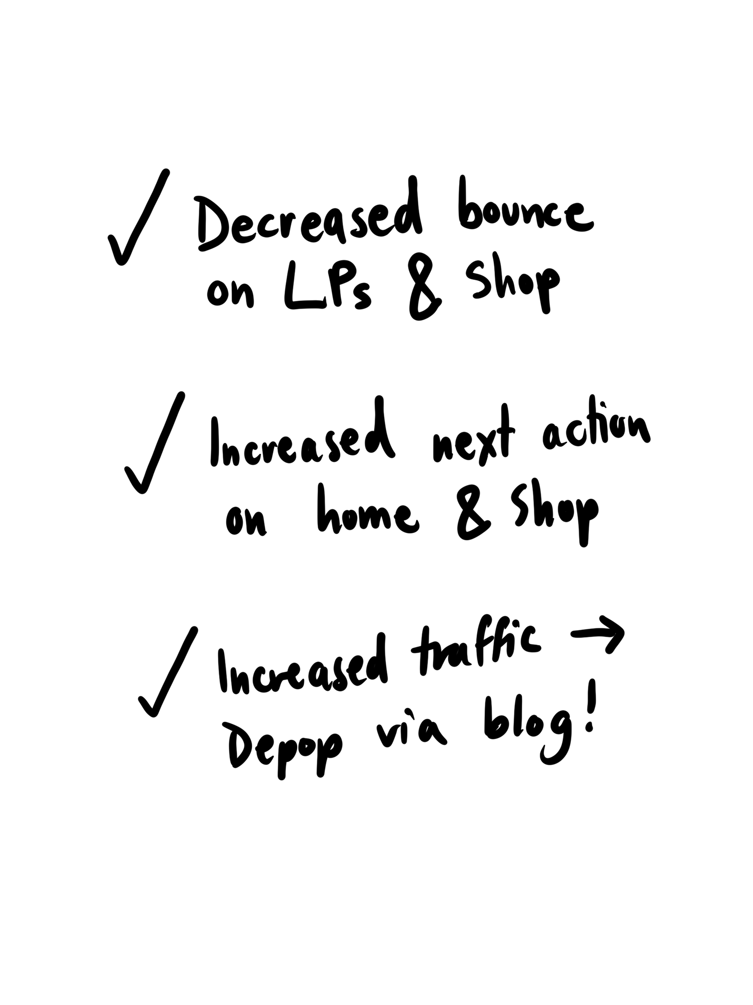
When landing experiences aligned with user intent:
Bounce rates decreased
Product exploration increased
Homepage engagement improved
CTA interactions grew
Content drove more users back into Depop
Most importantly, acquisition channels began functioning as connected journeys rather than isolated campaigns.
Reflections
Three lessons shaped how I think about growth design today.
Design should influence campaigns earlier
The strongest experiences happen when product and marketing shape the journey together.
Partnerships need experience planning
Exclusive content and creator experiences should be considered before contracts are finalised.
Systems create leverage
The biggest wins didn’t come from individual screens.
They came from creating frameworks that allowed teams to launch high-quality experiences repeatedly and at scale.